Digital Disability - Curtain University
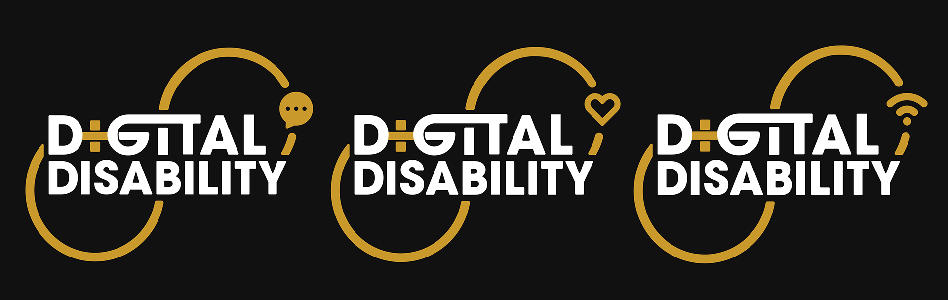
The Digital Disability logo symbolizes the connection among people with disabilities through digital platforms to foster community and highlights how the digital realm influences their engagement with the world. I designed this logo for a professor at Curtin University, drawing inspiration from the concept of 'interconnectedness'.
I followed Curtin University's brand guidelines closely, using colors like grey, gold, black, and white that are in line with the university's identity. The rounded shapes in the design give a friendly and inviting feel, while the strong, blocky letterforms convey the course's professional and scholarly nature.
Implemented large scale branding refresh
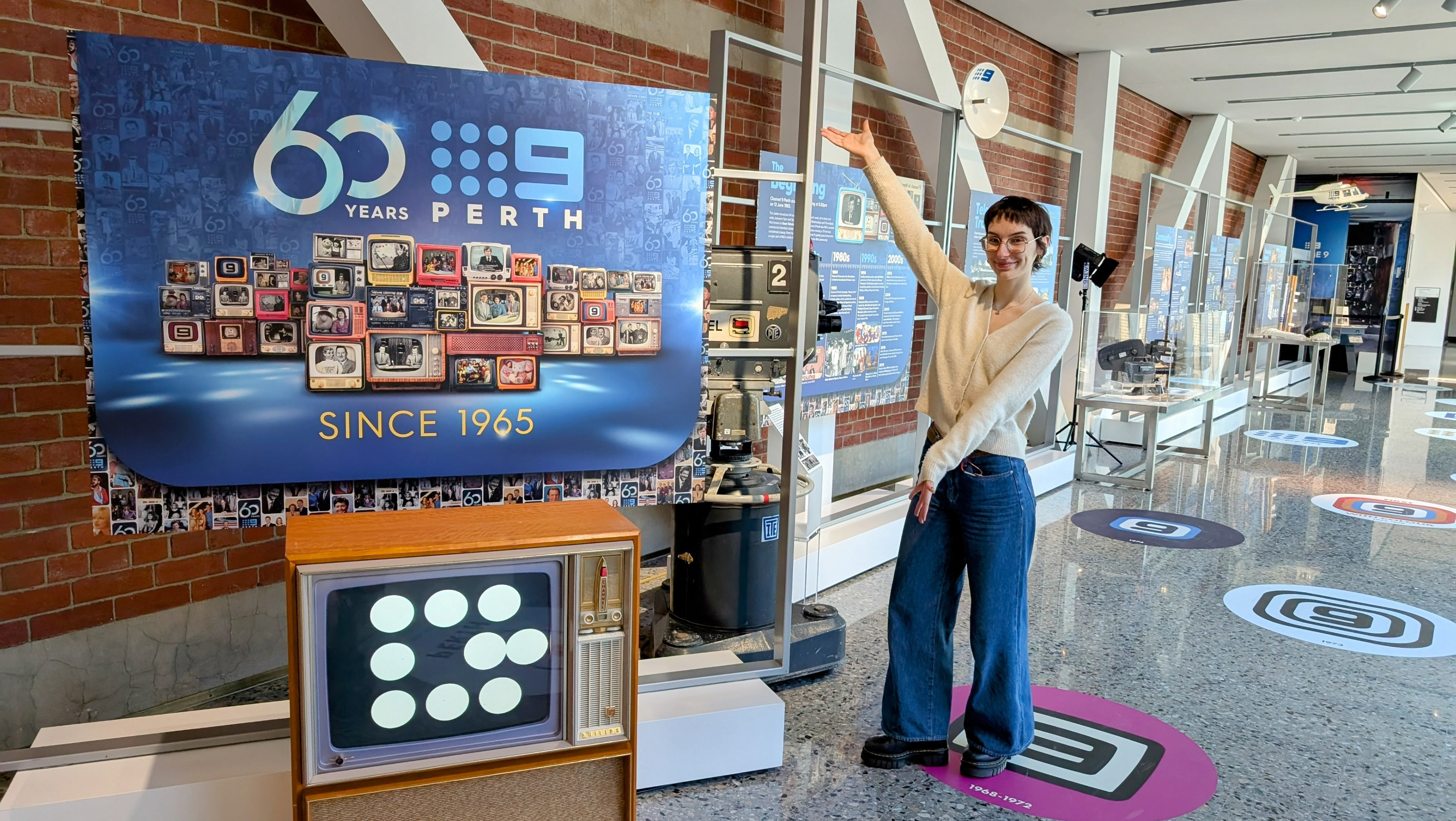
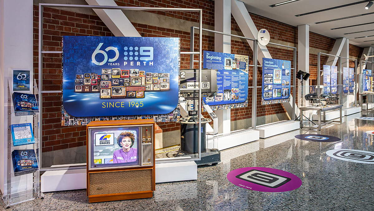
Channel Nine rebranded in January 2024, with my supervisor and I in charge of putting everything into practice for WA. it was a huge undertaking, going from an undefined style where nothing was out of bounds, to a strict 5 colour palette and one type face with only three weights permitted. We made the turn around as fast as possible and it gave me great insight in what it is like to be on the other side of a rebrand as big as this.
Below are some examples of how everything is looking post rebrand:
Footy News - Channel Nine News Segment
I created this logo alongside my co-worker Riley Halvorson, who helped bring to life the 3D texturing element of this segment logo. This was my first time creating a logo that would only be shown moving, so I couldn't pass up the opportunity to incorporate a 3d element.
Catholic Homes - Logo animation of pre-existing brand